Branding: Iridescent
Working with Iridescent since its inception, Ioana created the organization’s visual identity (and that of its Technovation program):
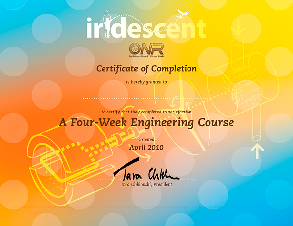
logo design, posters, stickers, flyers, T-shirts, brochures, banners, certificates, website badges, organizational charts, diagrams for funding, presentations, and reports.
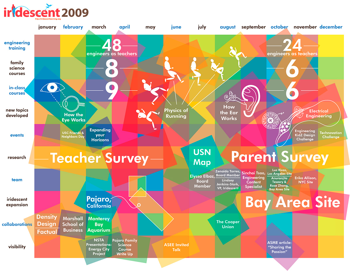
This has been an ever-evolving process, as the educational non-profit constantly reorganized and reclarified its focus.
So as to maintain some consistency during this rapid growth, graphic elements repeat, becoming something akin to the organization’s symbols or language.
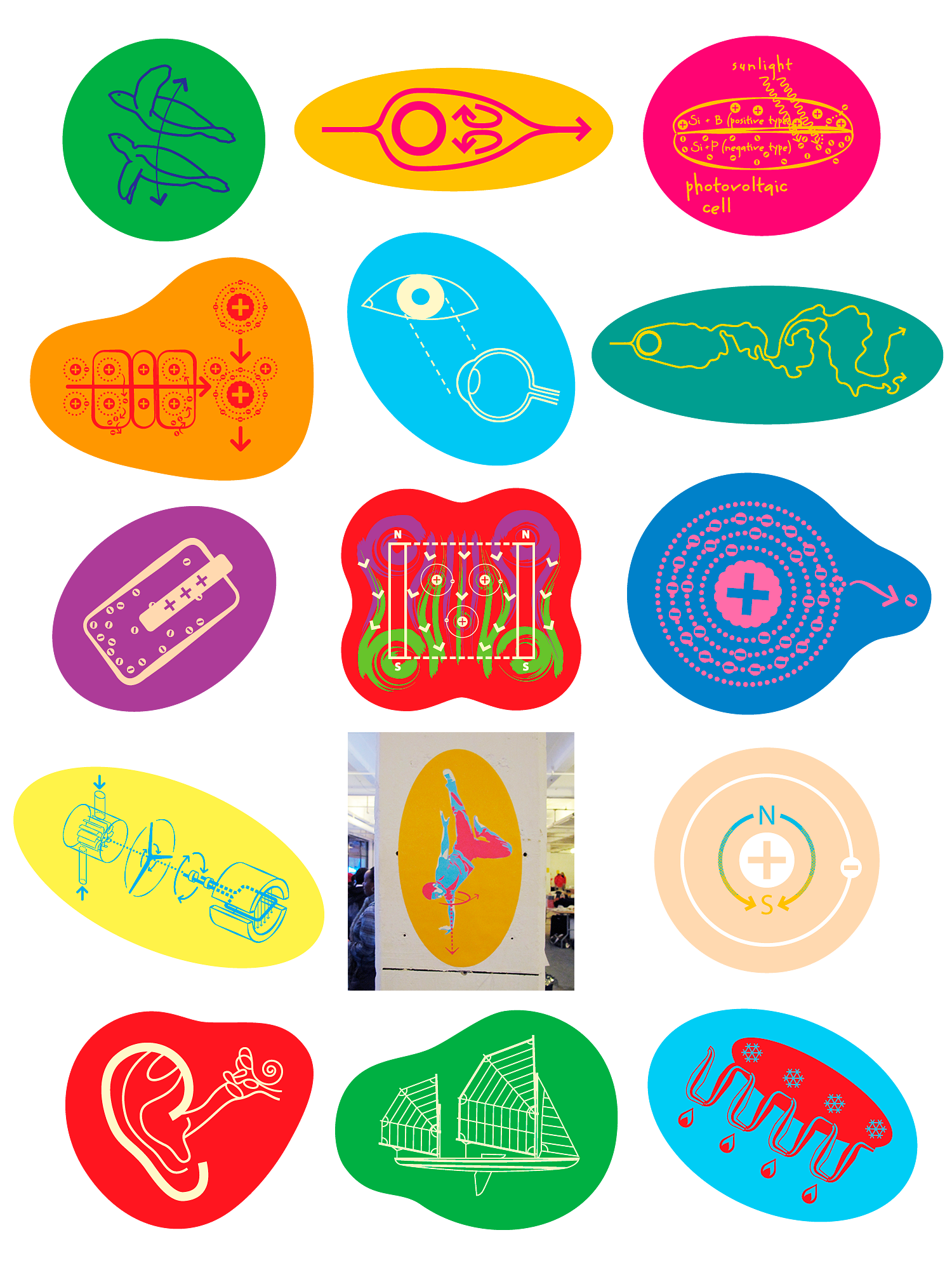
Some of them, such as the diagrammatic animals and molecules, come from science and engineering educational
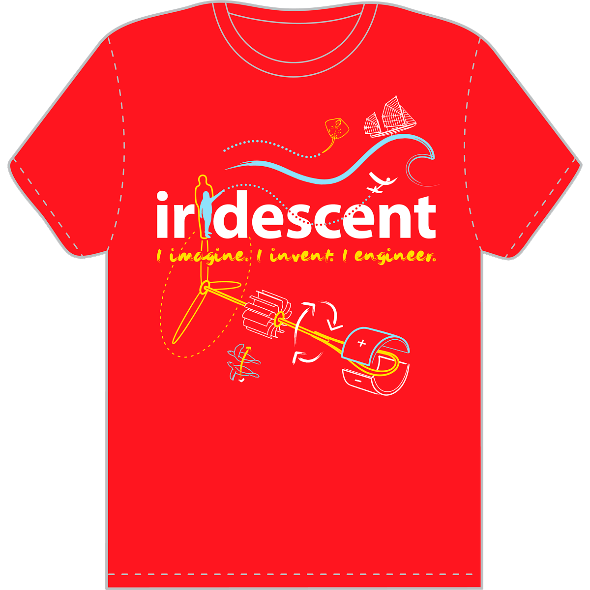
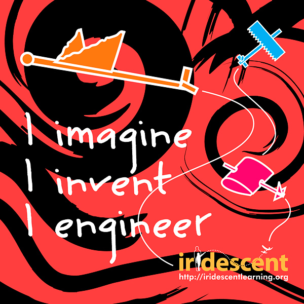
T-shirts & posters.
Others, such as the drawings of children doing experiments or the paper airplanes – all from Iridescent’s actual courses – come from earlier marketing materials.
Identity Design
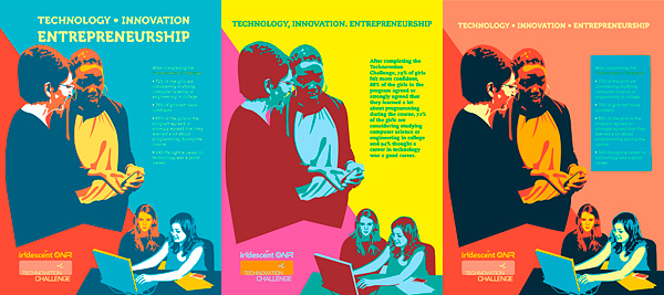
Logos & Marketing Materials
For
Iridescent
(International STEM Education Non-Profit)
Working with Iridescent since its inception, Ioana created the organization’s visual identity (and that of its Technovation program):
logo design, posters, stickers, flyers, T-shirts, brochures, banners, certificates, website badges, organizational charts, diagrams for funding, presentations, and reports.
Stickers
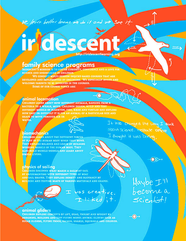
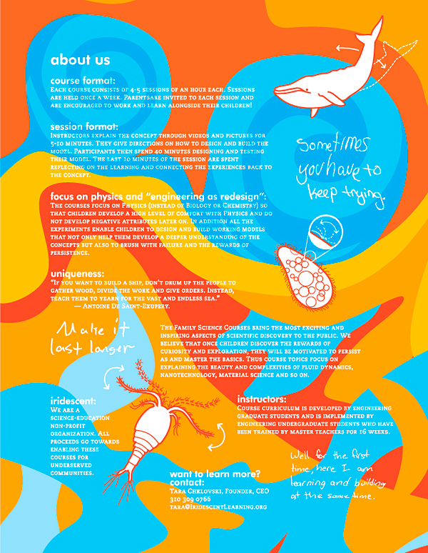
Mailer/Brochure
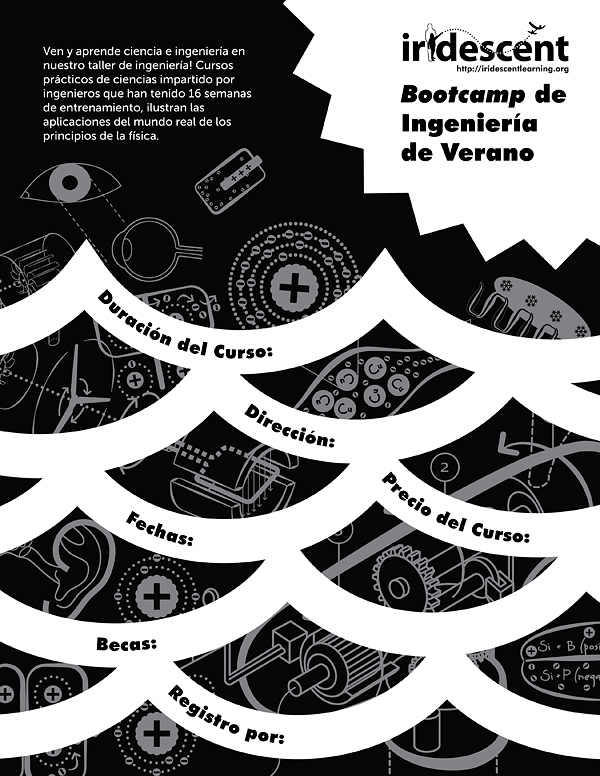
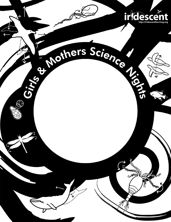
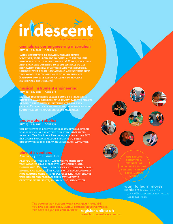
Fill-In Photocopiable Flyers
This has been an ever-evolving process, as the educational non-profit constantly reorganized and reclarified its focus.
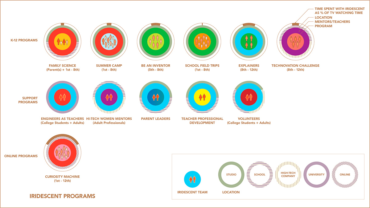
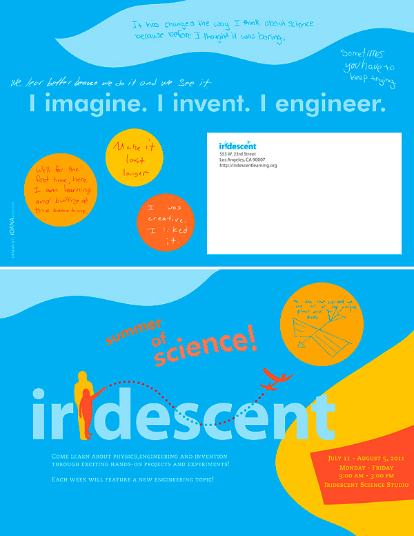
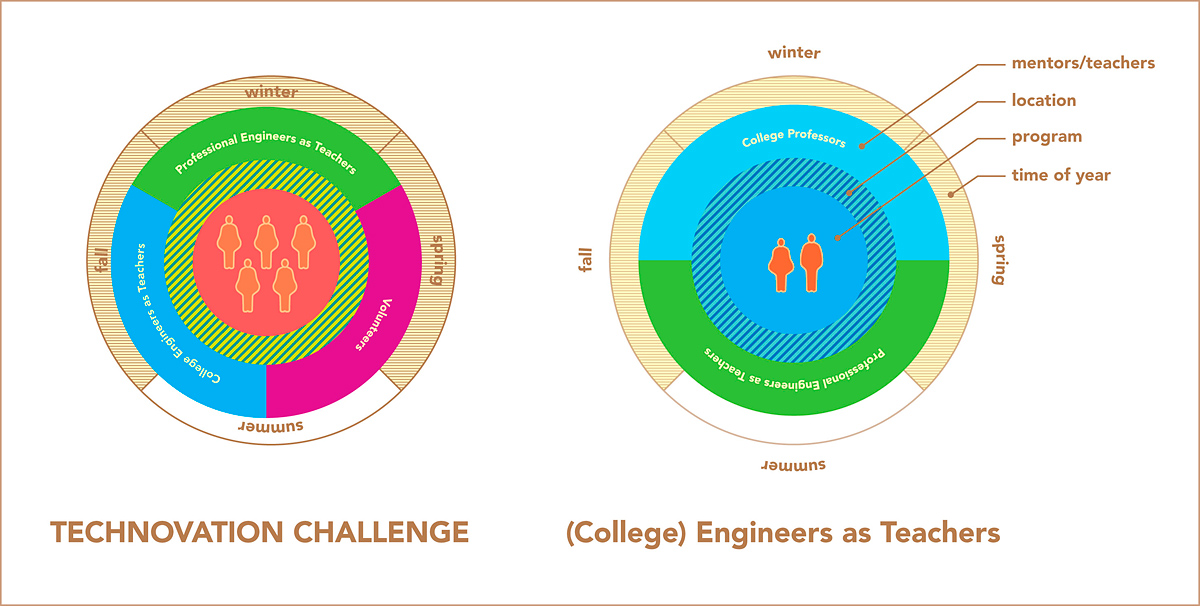
Organizational Info-Graphic (to break-down complexity & multitude of programs)
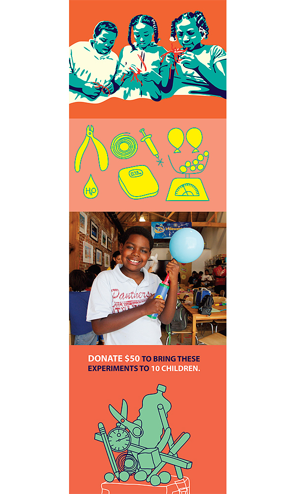
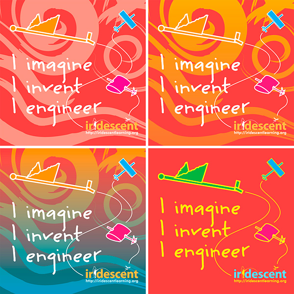
The main goal in the identity design has been to represent Iridescent as a fun, approachable, experiment driven, children’s STEM educational foundation:
bright colors, friendly forms, STEM diagrams, and images of children (and parents) doing experiments.
So as to maintain some consistency during this rapid growth, graphic elements repeat, becoming something akin to the organization’s symbols or language.
Some of them, such as the diagrammatic animals and molecules, come from science and engineering educational
T-shirts & posters.
Others, such as the drawings of children doing experiments or the paper airplanes – all from Iridescent’s actual courses – come from earlier marketing materials.
Stickers
Ioana also helped to coin the slogan “I imagine. I invent. I engineer.” and provided copy editing as needed.
The main goal in the identity design has been to represent Iridescent as a fun, approachable, experiment driven, children’s STEM educational foundation:
bright colors, friendly forms, STEM diagrams, and images of children (and parents) doing experiments.
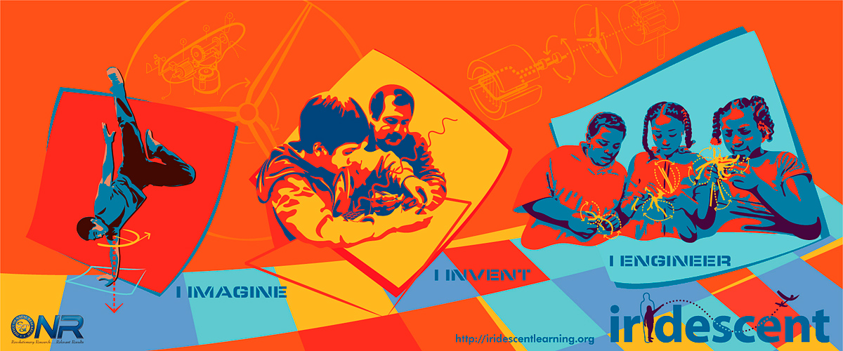
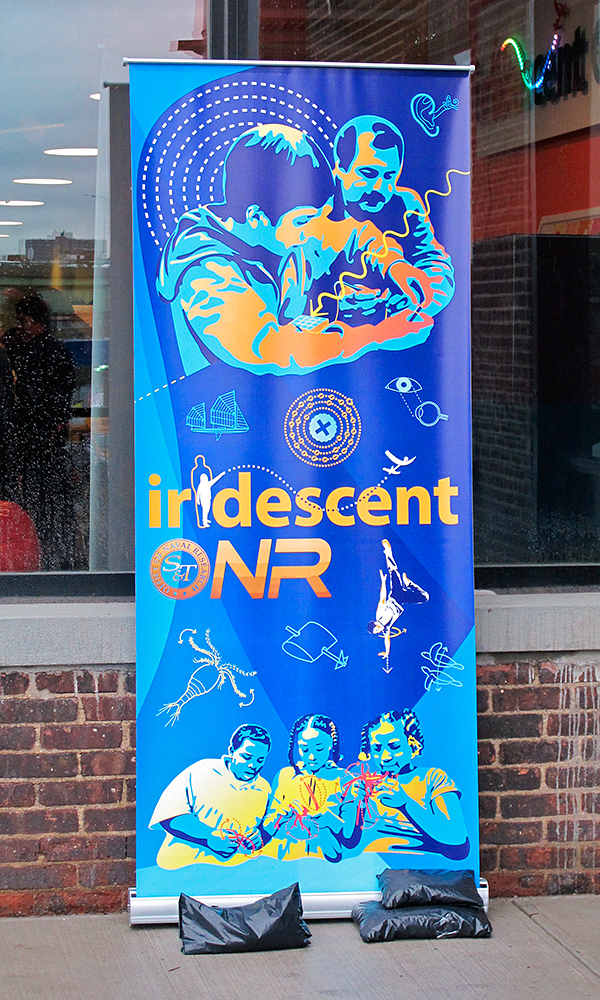
(Vinyl) Banner
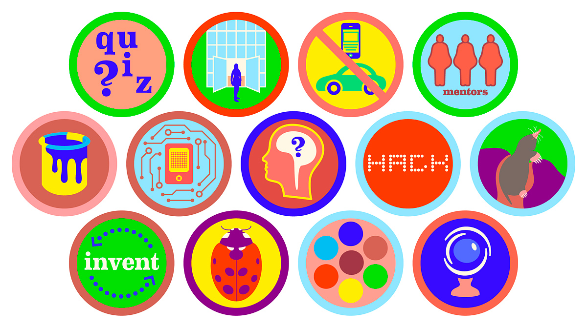
Technovation Website Badges/Buttons
Ioana also helped to coin the slogan “I imagine. I invent. I engineer.” and provided copy editing as needed.
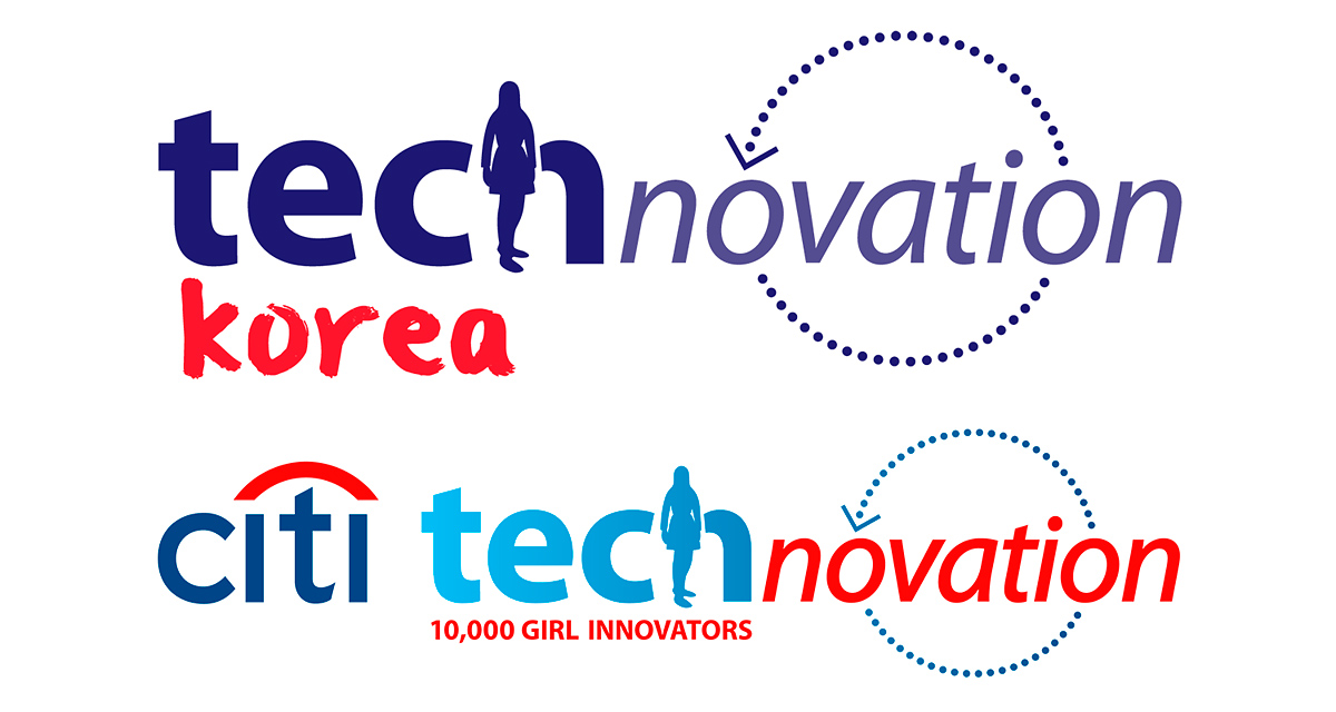
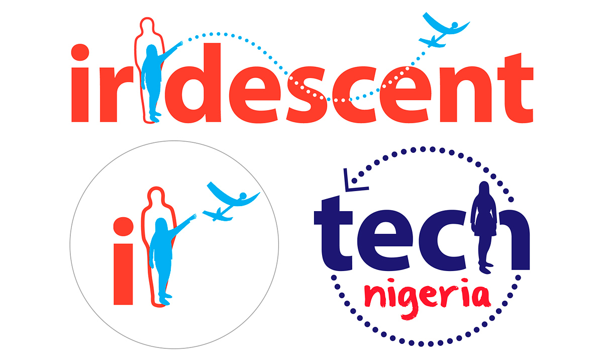
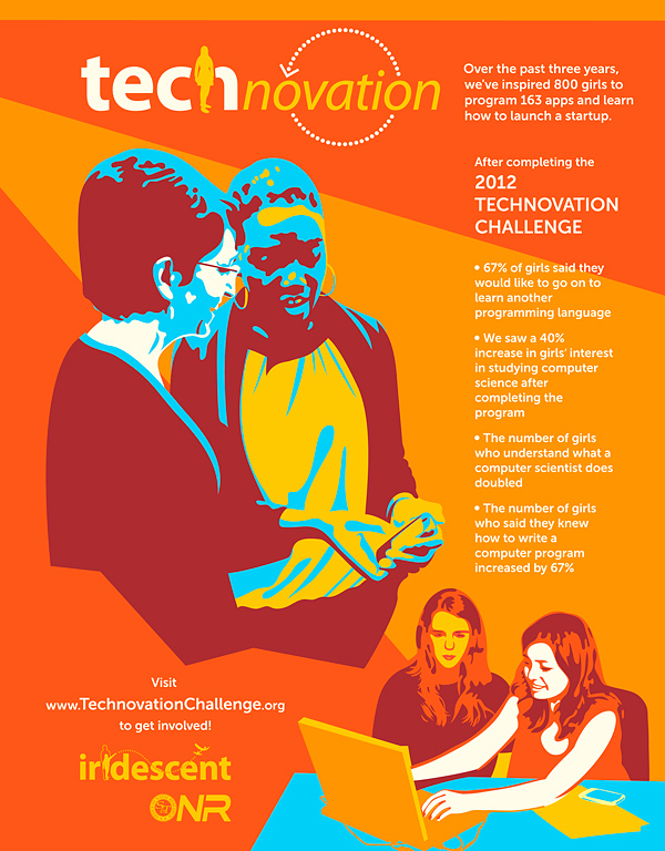
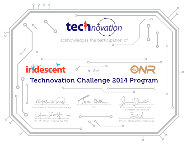
The Technovation logo, which came much later than Iridescent’s, remained purposely similar, so that it looks like it is part of the same organization.
While Iridescent’s logo embodies the essence of the non-profit by showing a child, supported by a parent, throwing a paper airplane,
the Technovation logo, in the same font, shows a teenage girl instead (this is a program for teenage girls)
and the flight path of the plane has turned into a circle representing re-design (it’s a coding program).
Work/Credits
Design: Ioana Urma.
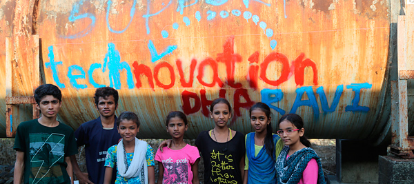
Photos of program participants: Iridescent.